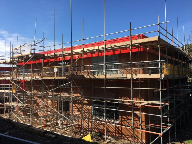
As you will have seen from our newsletter, our new Business Studies and Computing building is nearing completion. As part of this project, we have been working with Smarter Spaces, an education project arm of Dulux, to design the colour scheme for the building’s interior.
![]()
Smarter Spaces aims to help teachers and children thrive by enabling schools to design building environments to support better teaching and learning. Central to the approach is that teachers and children are involved in design, so they take more pride in their school.
Our students, with the help of Mr Smith and Mrs Foster from the Academy and Yusuf Alharrari from Smarter Spaces, have been working on the design brief for the interior of the new building since July 2016. The rest of this blog has been written with their help to show you what they’ve done!
The Smarter Spaces Project (by the Smarter Spaces Team)
We came up with the following objectives:
- We needed to understand what colours had to feature in the new building so it still fitted into the rest of the school
- We needed to work with Dulux’s Colour Advisor to create two colour schemes
- We needed to vote on which colour scheme we wanted to use
- We needed to work together to select what colours to go in what rooms
Factors to consider
- Needs to fit into the feel of the school
- The new build will be Tudor House, so Tudor’s red needs to feature in the building
- We needed to choose colours that would go with the red and with each other
- It needs to be easy to maintain
- This is our legacy – what we design now will be passed down to students who come to Churchill for years to come.
We then met with a colour consultant from Smarter Spaces to work on a design that fitted the brief.
Tudor Red
We decided to make the interior doors Tudor red, so that the building had a clear house identity. We also made the trim grey, which is easy to maintain and matches the outside of the Hall.

The “Teaching Wall”
Inside the classrooms, our Colour Advisor explained that research has shown that the “teaching wall” (where the screen and whiteboard are situated) should be a bright colour, so that attention is drawn to it. The other walls, meanwhile, should be a neutral colour. We also learned that walls should be painted in a single block colour so they are easy to maintain and so that they don’t distract attention from learning.
Choosing a colour palette
Following our brief, the Colour Advisor came up with sets of colours which would work with the red doors and grey trim. Option 1 was bright and exciting, because we told Dulux we wanted our school to be bright and energetic.

Option 2 was fresh and vibrant, because our school is in the countryside and surrounded by nature.

We voted – and Option 1 won (just)!
Choosing the colours for the rooms
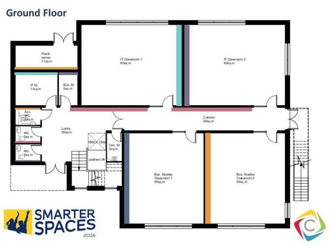
Once we had chosen the colour palette, we had to select which paint would be used for the teaching wall in each room. We used the architect’s floor plans to work this out.

Smarter Spaces then helped us to create a visualisation of what this might look like when the building was finished:
We presented our work to the Senior Teachers at the school – and they loved it! We can’t wait to see it in reality when the new building opens this summer.
Thank yous
As an Academy we are very grateful to Smarter Spaces for working with us, and for donating the paint to the project as part of the deal! They have been fantastic partners to work with and they have helped us to understand the design process, the importance and impact of colour, and to create a legacy for future generations of Churchill students.
Prepared by the Smarter Spaces Team:
- Molly Ebdon (WRO)
- Courtney Evans (SNM)
- James Goodyear-Evans (TPOC)
- Alfie Laws (WVP)
- Rowan Vine (HFH)
- Charlotte Wilkinson (TMR)
- Charlee Beach (HLCB)
- Paige Evans (TMB)
- Katie Ward (SASH)
- Mr Smith
- Mrs Foster
- Yusuf Alharrari from Smarter Spaces
Thank you!

Pingback: The Alan Turing Building | The Headteacher's Blog
Pingback: Transforming the learning environment | The Headteacher's Blog